One-acting Digital Government Instances
Social Security Bank
Project Lead & UX Designer
8 Weeks - Early 2022
Research & Design
The Social Security Bank (SVB) in the Netherlands had a quest to come up with a new Customer Journey for the registration of a child and to apply for child benefits. This new Customer Journey should be suited to work together with the coming changes and the further digitalisation of these processes. This process is being changed to match the view people have of the government, the so called “one acting government”.
The scope for this projects was to research a solution, design this solutions and validate this design as much as possible. The final delivery would be an advise on how to proceed and a prototype of the final concept chosen.
Old process
In the old situation there were two different processes, the birth application process at the local municipality and applying for child benefits at the Social Security Bank of the Netherlands. The registration process can often only be done offline, while applying for child benefits is mostly done online.
After analysing the current situation from the view of parents and the government instances I already found the following problems and challenges to tackle in the redesign:
Different processes across municipalities
All the municipalities are responsible for their own child registration process, with lead to not only different processes, but also different information and support provided to parents across municipalities. All parents should get the best the best information and support.
Digitalisation
In recent years more and more thing are digitalised and people are expecting the government to go with the change. This digitalisation provides an opportunity to improve and simplify processes, making dealing with government instances more pleasant and easier.
One moment, multiple processes and multiple instances
The most obvious thing to note is that the parents have to do multiple different processes at different government instances, once they have a new-born child.
Finding Key Problems
Besides interviews with stakeholders I also spoke with the target audience to find out what their feelings and emotions are at different steps in their flow. This gives me a great insight into what areas to improve upon from an user experience point of view.
When combining the reseach findings thus far I am able to make the following customer journey map that displays the experience, the pros and cons, and the emotions and feelings of the users while interacting with the product:
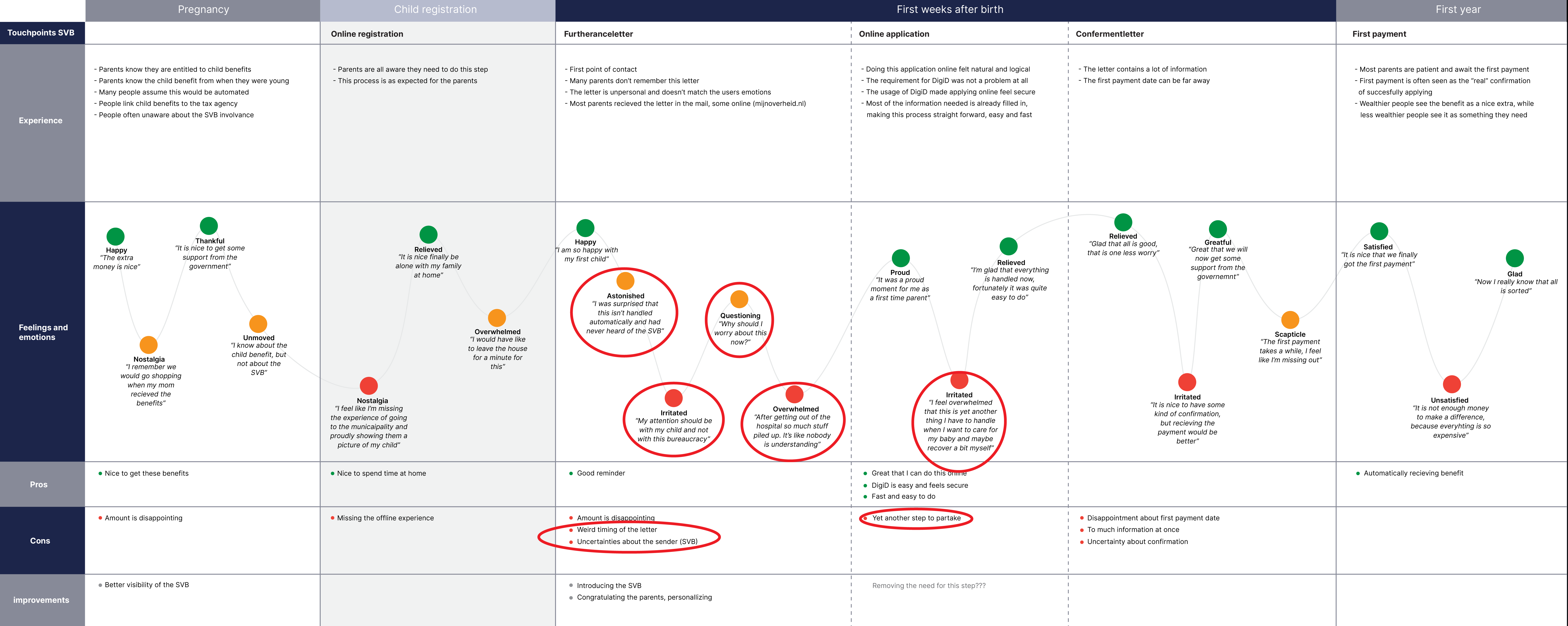
image: Journey of applying for child benefits in the Netherlands with pain points highlighted
When looking at the customer journey map we can see that a number of the painpoints for the users are within a certain part of the journey.
Customers are irritated with the timing of the various processes
A large number of the interviewees mentioned they would rather not deal with these processes just after a child is born, after all they already have enough to worry about. Having to do the application that feels like another child registration process was irritating.
Customers do not recognise the Social Security Banks involvement
Among younger interviewees I noticed that many of them were unaware of the Social Security Bank and that they were responsible for the child benefit application. This astonished some interviewees and confused others. possible.
Customers do not expect that they are required to apply for child benefits
Many of the interviewees told me that they did not know they had to apply at that time, and many even mentioned they expected it to be handled automatically.
Defining Problem Statement
When combining the previously mentioned 6 research findings and after doing many iterations the following problem statement was defined:
"Unexpected requirement of an additional application process due to insufficient collaboration between government instances with less than ideal timing"
Researching solutions
To get a bit of a head start I researched how other countries are handling the same or comparable processes through Competitive Analysis. By comparing these processes and learning will put me one step ahead in redefining the user flow.
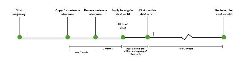
image: Journey of applying for child benefits in Belgium
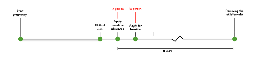
image: Journey of applying for child benefits in Spain
When comparing the flows of the different countries, the steps in those flows and the timelines of the processes we can come to the two following conclusions that will give us direction in determining a new flow for the process in the Netherlands:
we are in a transitional period of how these kind of government processes are handled across Europe with the Nordic countries going fully digital, while countries in the south Europe are starting to implement their first digital processes to support their processes on paper.
Nordic countries have a one step registration and application process in place, that has been working perfectly for a few years now and are well receive by users. This shows us that such processes can be combined without major problems for the government, while being way more user friendly.
Redefining User Flow
By closely examining the flow and shared information, I reduced the user flow by two steps. The reimagined flow simplifies and shortens the process, addressing most customer/user pain points. Some issues remain beyond the project's scope but will be mentioned in the final recommendations, along with suggestions for improving the user experience.
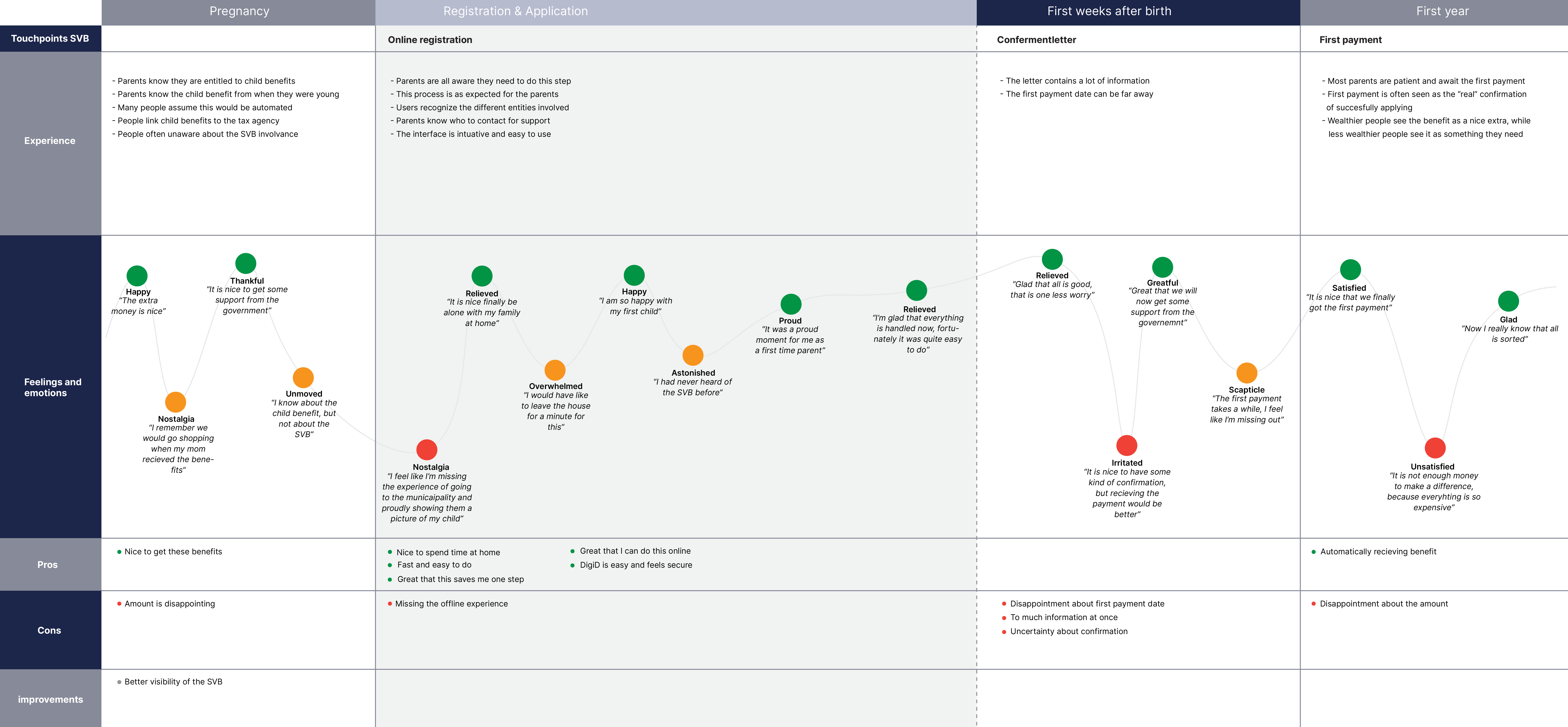
image: Improved journey of applying for child benefits
Solution Design
Now that the goal of the final solutions and the user flow are clear it has to be translated into a prototype. The first step in this is making sketches so that the flow of the individual screens can be further explored without having to invest to much resources at this moment. To make it easier to test the sketches they have been digitalised.
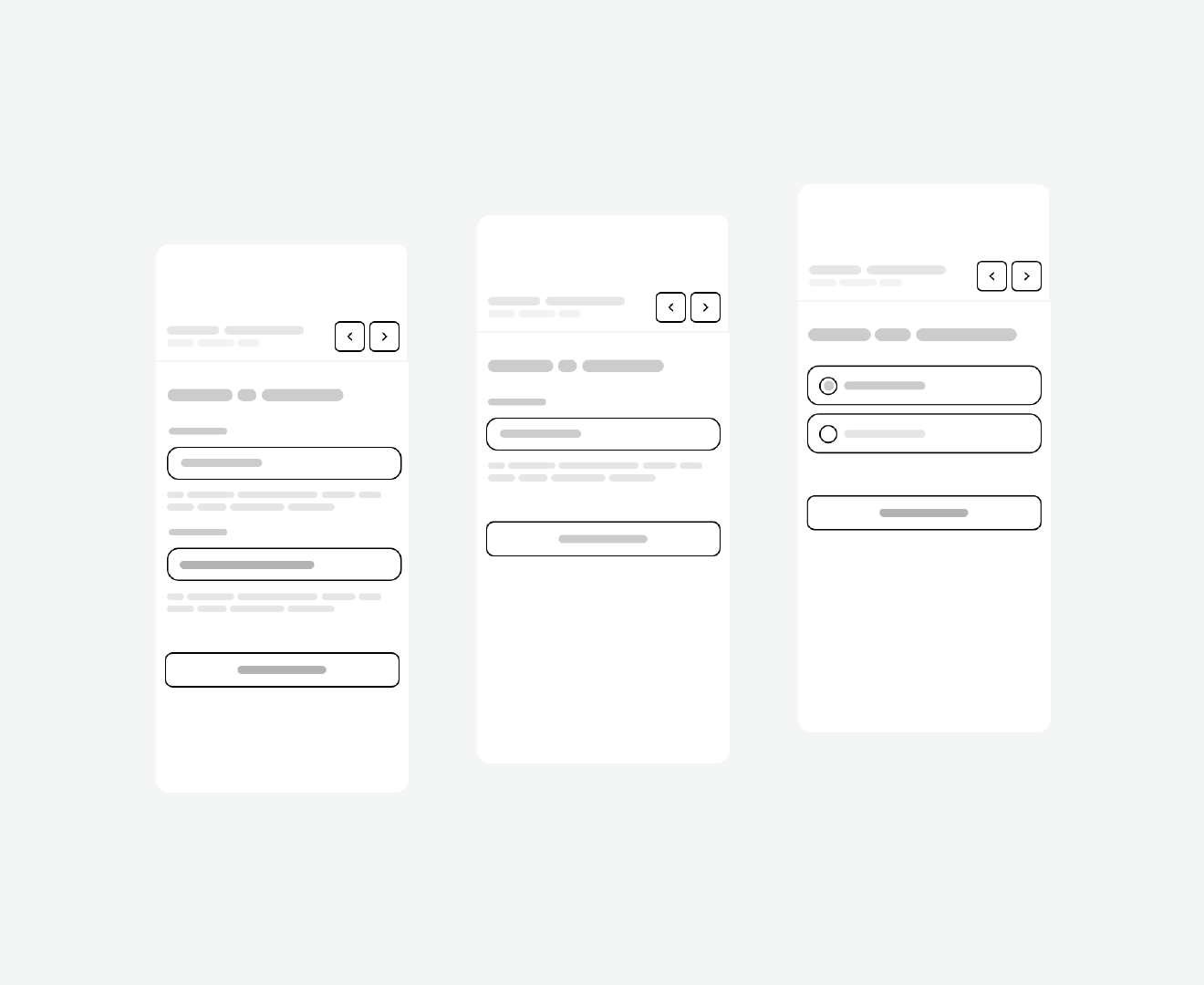
image: Sketch of the proposed solution
This initial flow of all the individual steps and screens has been thoroughly discussed with experts and stakeholders and based on the feedback the sketches were translated into wireframes. De main change was making a more clear hierarchy in the interface.
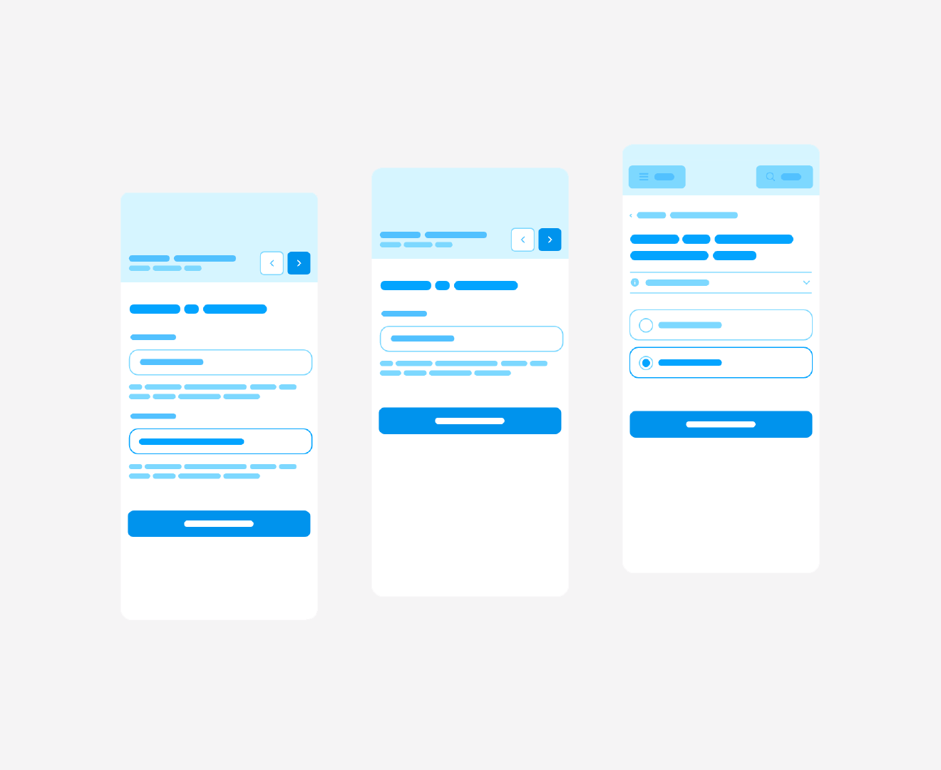
image: Wireframe/low fidelity of the proposed solution
When the wireframe version was approved the screens were developed into a high-fidelity design. The purpose of this high-fidelity is to conduct user research, therefore we skipped straight to a high level of detail. We were able to do so as both the municipality of Haarlem and the Social Security Bank have a clear design system to follow.
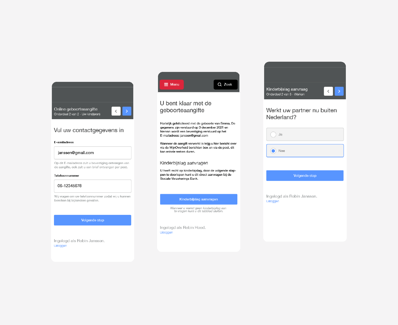
image: Initial high-fidelity version of the proposed solution
From the above displayed high-fidelity prototype onwards all iterations will be tested with users in order to further improve them. To do this the System Usability Scale (SUS) will be used. This standardised questionnaire will provide a good indication of the usability of the prototype. Together with some additional questions this provide us with sufficient input to further improve the prototype design.
Usability Testing: Round One
The first round of usability testing showed great potential with a SUS of 73,125 which is well above the industry minimum of 68. From the interview questions it became evident that users struggled to determine what government instance was responsible for which part of the flow.
This is something that also surfaced while doing the initial research on the as-is customer journey, but was deemed not sufficient enough to worry about at that point in the process. However, combining the processes has increased the uncertainty about the SVB being involved.
With this feedback in mind, the first iteration on the high-fidelity prototype was made. The main change om this iteration is making use of the colours and visual elements of the SVB and an additional screen to further explain the SVB’s involvement.
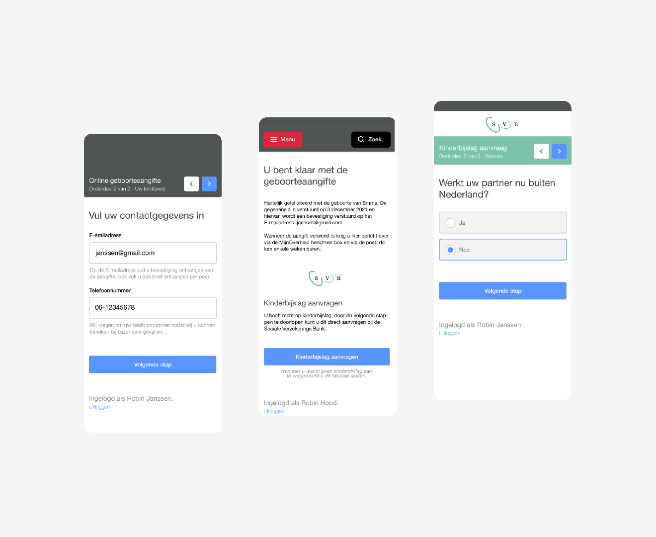
image: First iteration on high-fidelity version of the interface
Usability Testing: Round Two
With these changes the user was able to more successfully distinguish the responsibilities of the involved government instances. However, the changes to the interface resulted in a drop in the SUS score to 66,667.
In the interviews during this usability testing we were able to identify that the cause for this drop are concerns about multiple government instances being involved. Now that people are better aware of this they also have more concerns about resolving possible problems.
In the following iteration the main goal is taking away the users fear by providing more and better information.

image: Second iteration on high-fidelity version of the interface
Usability Testing: Round Three
After another round of usability testing we see a slight improvement of the previous iteration with a SUS score of 68,75. This is more than the set minimum and therefore the interface is deemed usable.
However, this is not the result we were aiming for, the expectation was that the score would more significantly increase. When looking at the results we noticed two things:
- There is a clear outlier in the results that influences the results. This is a risk we accepted as we went for a smaller sample size, therefore not a reason to worry.
- Most of the test participants found there to be too much inconsistency in the prototype.
With this in mind the last iteration was made on the prototype design. This focus of this iterations was to get down to the details and ensure consistency throughout the entire prototype and to make the design more accessible to comply to international WCAG 2.1 standards for public sector interfaces.
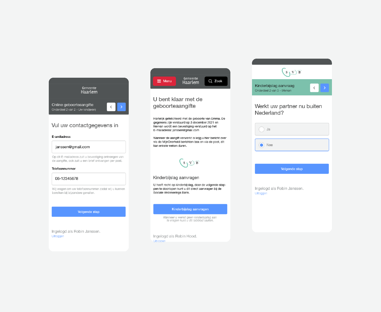
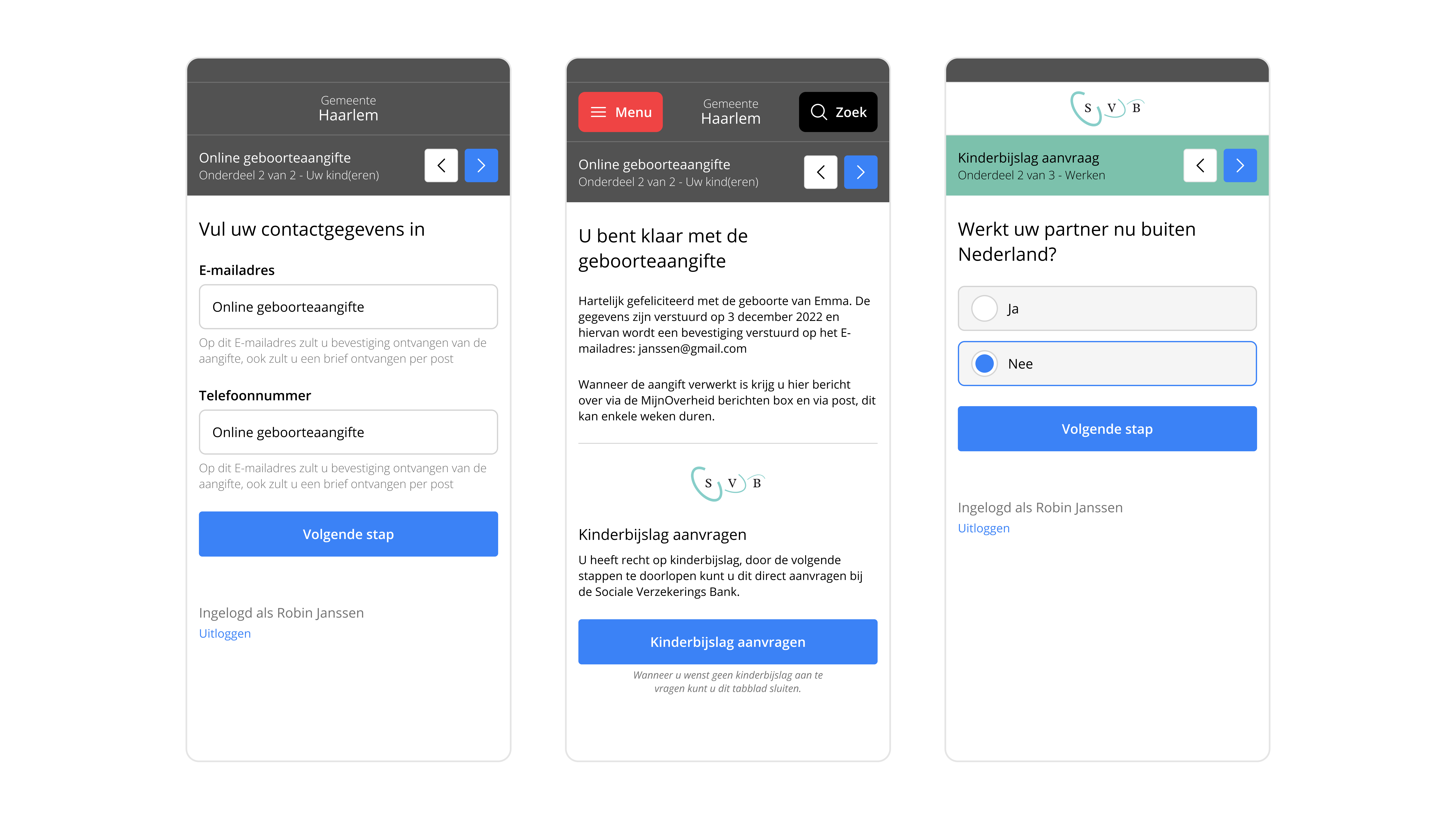
image: Final version of the interface design
Usability Testing: Round Four
With this final iteration the we were back up to a very respectable SUS score of 85,85. This proves that the design is easy use for the target audience, while having a clear distinction of responsibilities between different government instances.
This final iteration of the prototype was presented to the municipality of Haarlem and the Social Security Bank. The next step lays with them in making a POC for the backend implementation and the final implementation of the feature.
Conclusion
By gathering stakeholder requirements and understanding the users experience on a deeper level we were able to come up with an improved user flow that allows for combining multiple processes at different government instances into a single process.
By realising a prototype in iterative steps this reimagined flow has been validate with users. User testing has also ensured that the designed interface is easy to use and makes sufficient distinction between the different government instances involved.