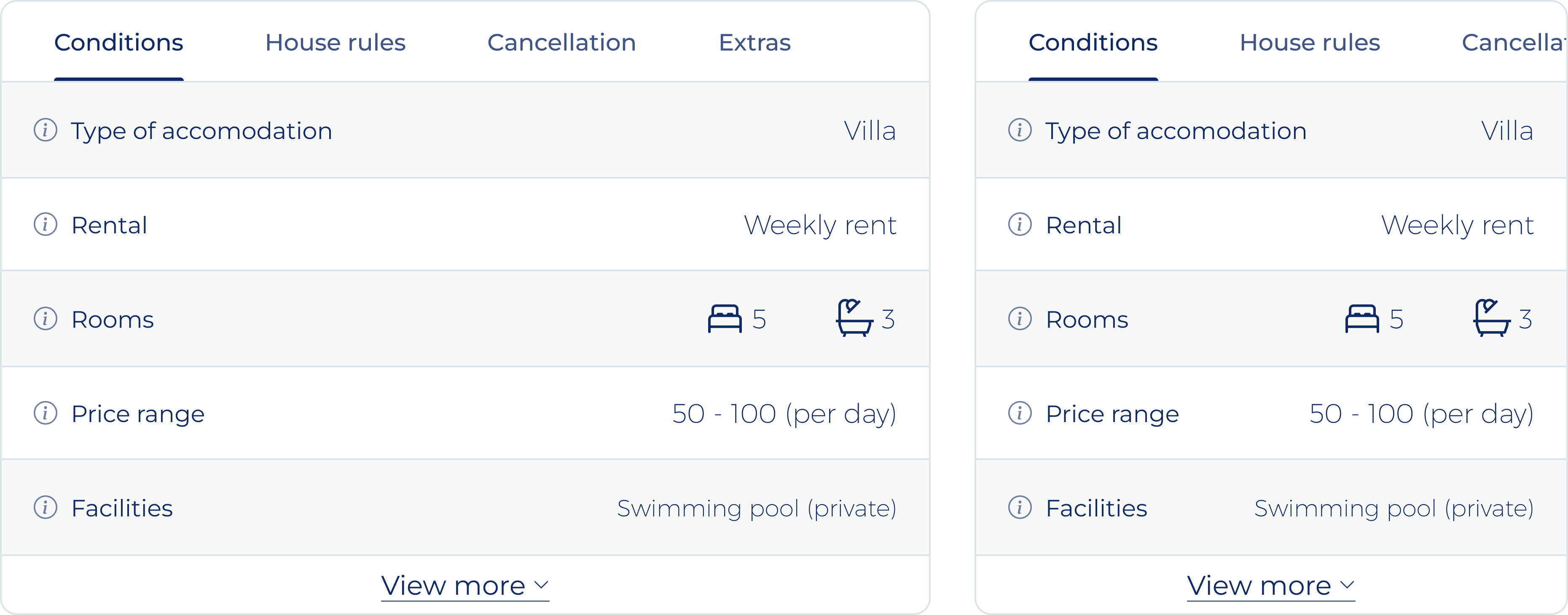
Information-heavy multi-tab table
Luxury Location Guide - Marbslifestyle
UX/UI Designer
5 Days - Early 2024
Design & Hand-off
Marbslifestyle.com is the location and inspiration guide with information about everything you might want to know during your stay in Marbella, Spain. From the best restaurants in old town to the most extensive event calendar that Marbella has to offer.
The newest addition to the platform are rental properties. To properly inform users it is important to give them all the information about the properties available like amenities, rentals conditions, house rules and the cancellation policy. Having this abundance of information does not match the current style of the platform and makes the pages lengthy while the information is only relevant to users with real interest in the property.
Problem / Opportunity
"Current components of marbslifestyle do not allow to display an abundance of information in a clear, easy to use and compact manner."
The type of content to be displayed in this new section varies from certain tables about the amenities available to lengthy statements about the cancellation policy of a certain property. Furthermore, not all properties will the same number of conditions to be added to this section requiring flexibility in the way the component is used.
Requirements
When looking into this case, there are a few options that come to mind right away, like using pop-ups or slide-overs, making use of accordion elements, or using a dropdown to select which content to display. While it is tempting to pick one of these right away, it is important to further research and analyze to ensure the right solution is picked and developed the first time around.
To make a well-substantiated decision on what type of component to use to beat this challenge, I made a small requirements analysis. With a clear list and understanding of the requirements and goals, the decision-making process will be simplified significantly.
After thoroughly thinking through what the component should be able to do, I wrote the following list of requirements, split into Must Haves and Should Haves:
Must Haves
- The solution must be compact, while housing an abundance of information.
- The solution must be expandable to display the full content when needed.
- The solution should match the style and aesthetic of the platform.
Should Haves
- The solution should be easy to use and make the information easy to consume.
- The solution should only display one of the categories of information at once.
- The solution should display all information categories without the user having to perform any interaction.
- The solution should work both on desktop and mobile devices, while being visually similar and recognizable.
Concepting
Starting of the design phase is a round of concepting to come up with as many different solutions as possible in a short amount of time. This I prefer to do using digital wire-framing, the added accuracy and ability to work in a bit more detail helps me to visualise a solution better over sketching wireframes on paper. Beside the initial 3 options I came up with 3 more solutions before I felt I had explored sufficiently for this phase of the project:
Dropdown
A container is displayed in which the information will be shown (left), with the dropdown allowing the selection of different information sets (right).
Easy to adapt for desktop and mobile designs.
The dropdown and the content container might seem too unrelated.
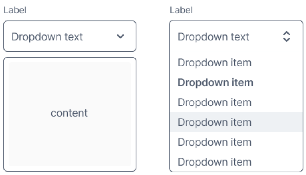
image: Wireframe of dropdown concept
Slide-over
When clicking on one of the categories (left) of additional information, an overlaying panel will open from the side or bottom to reveal the content (right).
Unexpected and not consistent with the website's interactions.
Chip-styled buttons are often associated with filters and toggles.
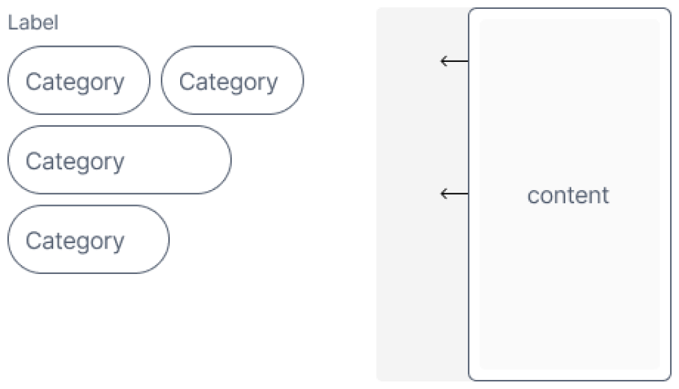
image: Wireframe of slide-over concept
Pop-up
When clicking on one of the categories (left) of additional information, a pop-up will appear, overlaying all other content (right).
Unexpected and not consistent with the website's interactions.
Chip-styled buttons are often associated with filters and toggles.
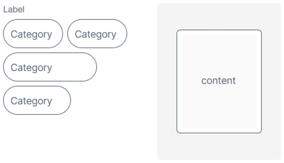
image: Wireframe of pop-up concept
Accordion
When clicking on one of the accordions (left), it will unfold to reveal more content (right).
Unexpected and not consistent with the website's interactions.
Chip-styled buttons are often associated with filters and toggles.
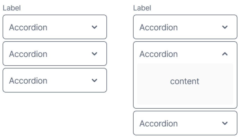
image: Wireframe of accordion concept
Scrolling with sticky header
The content is split into paragraphs (left). When scrolling, the heading of the paragraph at the top of the container will remain fixed at the top (right).
Easy to implement for both mobile and desktop design.
Most of the content is hidden with no indication of it being there.
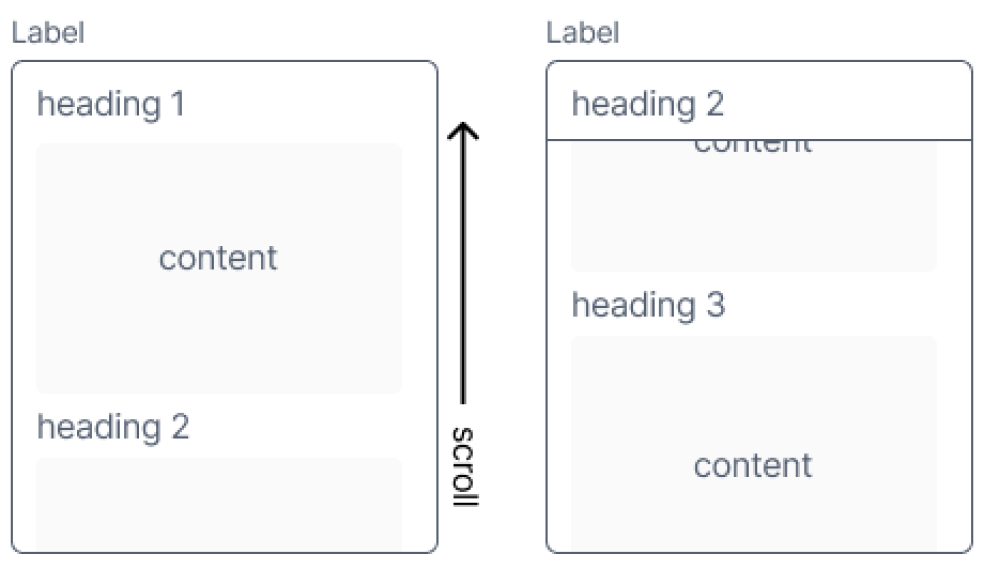
image: Wireframe of scrolling with sticky header concept
Tabs
The content is split into paragraphs (left). When switching tabs, the heading of the selected paragraph is shown (right).
Easy to implement for mobile and desktop designs.
Allows for a “see more” toggle feature.
Only the first few labels are clearly visible from the start.
image: Wireframe of tabs concept
When checking these concepts using the previously mentioned list of requirements I noticed three concept seem to comply with all the requirements, the slide-over, pop-up and the tabs. The accordion seems to take up too much space, while the slide-over and pop-up do not show any concept right away making this element potentially hard to notice.
After further consideration I decided to continue with the tabs concept for now as I deemed the slide- pop-up concept to be fairly intrusive (especially on mobile) while the content does not have priority over the other content on the page. I decided against the slide-over as I foresee issues with the horizontal space available on mobile devices.
Refining concept
With the main concept set, the next step is to further define the details of this concept with regards to the functionality and the visual style. For this I made numerous draft of design all with a slightly different style, I chose to work in high-fidelity as this allows me to make realistic mock-ups.
These realistic mock-ups are important to decide if the design fits with the other concept of the website. To make the designs as realistic as possible I made sure to try them with all types of content we are planning to house in this section, mainly text and tables.
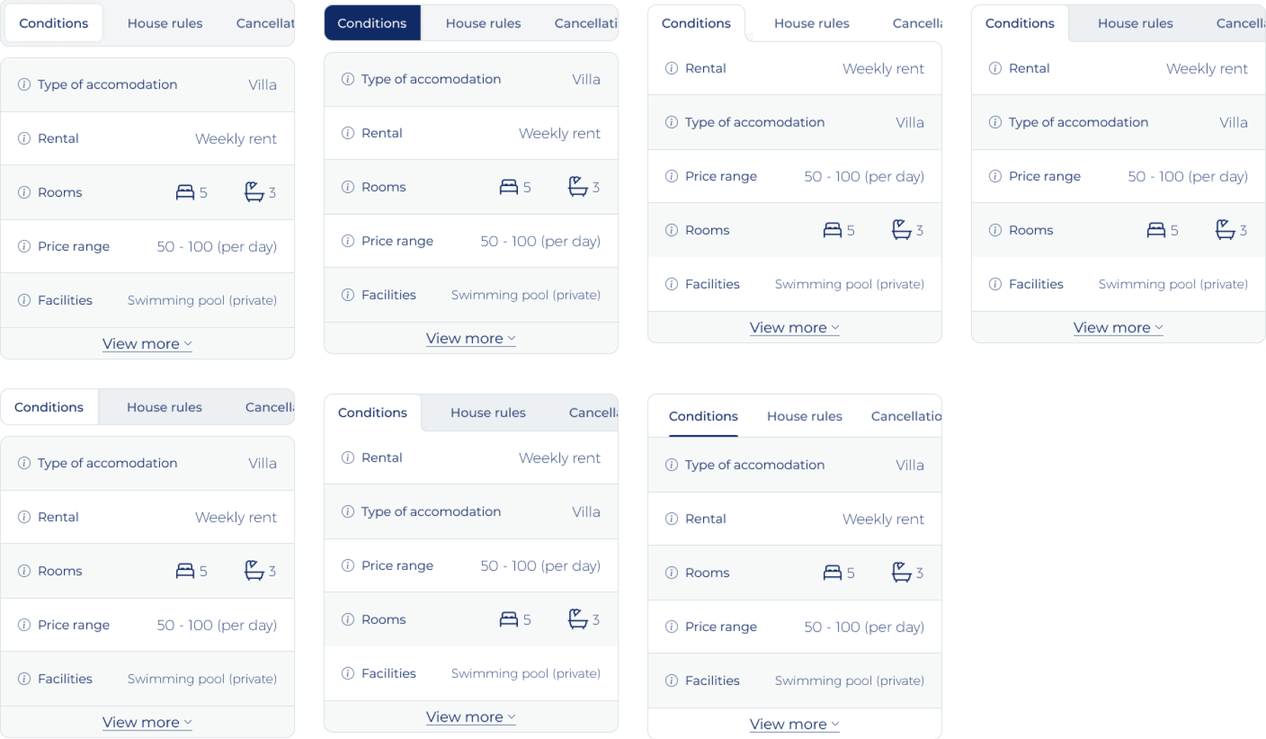
image: High-fidelity design of different tab styles
While testing these designs in a mock-up I noticed a few things that are important factors in choosing the final design for this element:
- The background to the unselected tabs cannot be darker than the rest of the background as most of the pages has subtle background and this element does not have to stand-out that much.
- All designs with the tabs separated from the content of the tabs do not fit the current style of the page and the platform.
- A visual separation between the tabs and the content within those tabs works better, especially when this content is a table. This separation is important, otherwise the rab navigation seems part of the table.
Final concept design
Based on the requirements set for the element and the finding from the visual experiments there is one variant that stand out from the rest (7th in “image High-fidelity design of different tab styles”). Main reasoning behind this choice being:
- A visual differentiation between the tab navigation and the content of the tab.
- The element will form a container around the content within the element making it easy to create a “view more” functionality to compress the size of the element.
- The tab style does not require too much horizontal space, making sure that most or all of the tab labels will be in view even om mobile devices.
- When not all labels are in view the navigation on (mobile) devices is easily understandable and usable with a simple swipe gesture.
- The indicator for the active tab is commonly used and clear, while not taking away too much attention from other content on the page.
- The width of the content within the element is not compromised too much, tables can be edge-to-edge in the element.
- The element can be used both on desktop and mobile devices without the need for any additional development efforts.
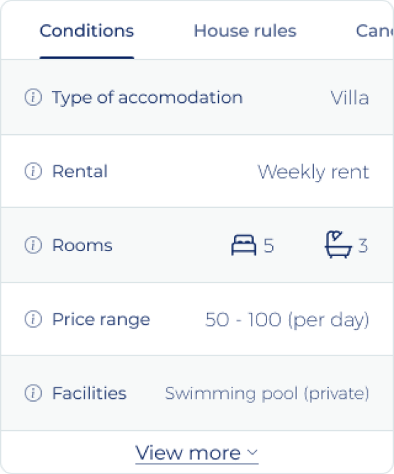
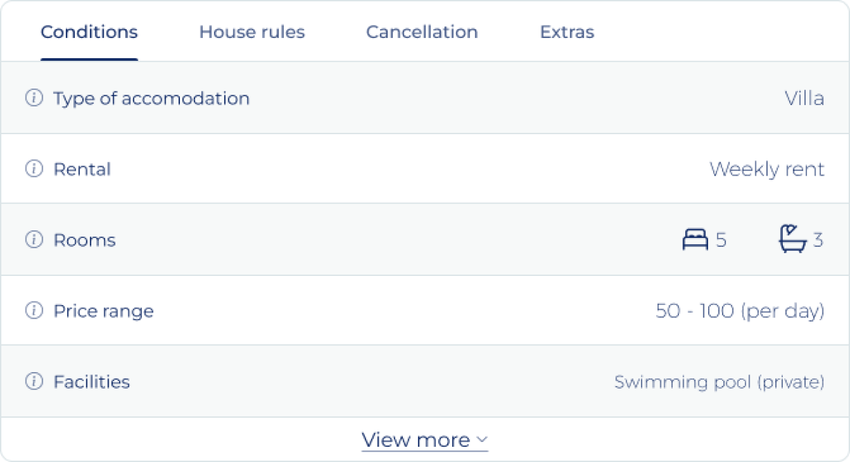
image: High-fidelity design of different tab styles
Development hand-off
After successfully walking through the design phases the design need to be handed-off to the development team that will make it a reality. In my experience, especially with less experienced development teams, a more detailed and exact hand-off can eliminate one or multiple review and bug fixing rounds. To work more efficiently as a company, making a detailed hand-off is worth the additional effort required.
Anatmoy
Explains what elements the design is made up off and the functionality per element. This puts everyone on the same page on what elements make up the component and their functions.
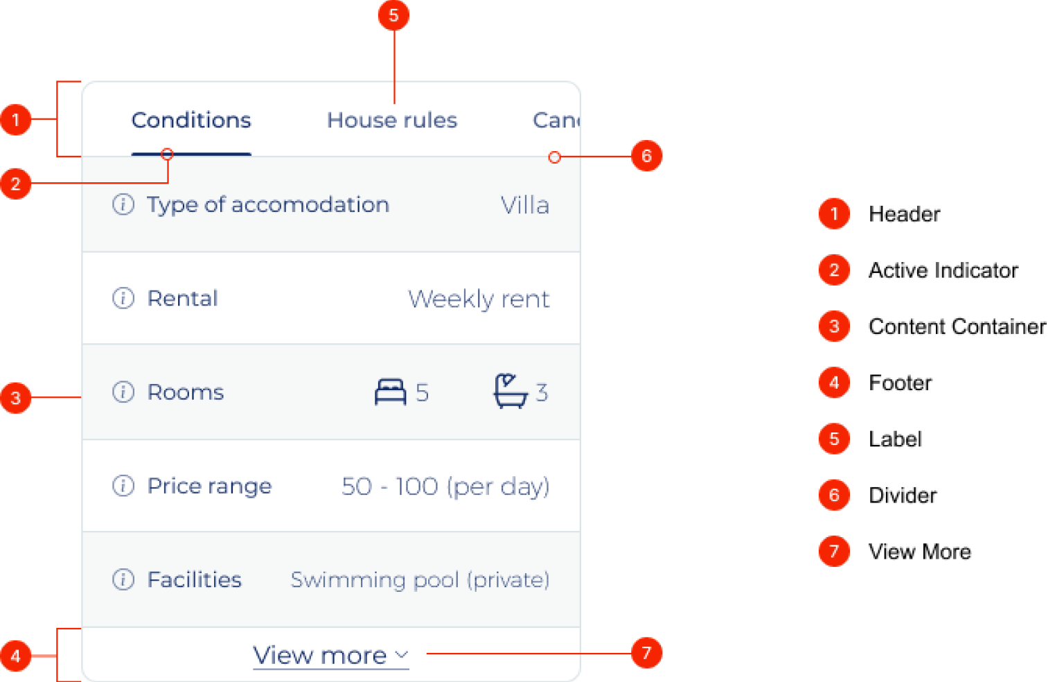
image: Anatomy of final concept design
Depending on the use of the component not all of the elements will always be present. Namely the footer and the view more element will only be present whenever the height of the content container exceeds the set maximum height.
Spacing
Explains the setup of the component and the spacings to help developments teams to accurately recreate the design.
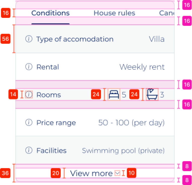
image: Vertical spacing of final concept design
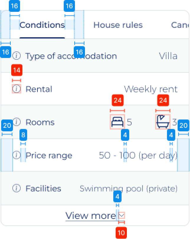
image: Horizontal spacing of final concept design
Whatever is not specifically defined will either hug the content or fill the container. For example the tabs at the top will hug the content (with the additional padding) and their width will change based on their content. Details on this are provided to the developers in the briefing.
Colours
Elaborates on the colours used within the design, blue indicates background colours, red indicates the colour of text or content and the green coloured number elaborates on the stroke colour.
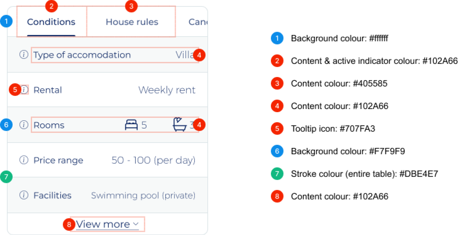
image: Annotations on the colours of final concept design
Typography
Highlights the typography used in different sections of the interface by explaining the font, font size and the line height being used.
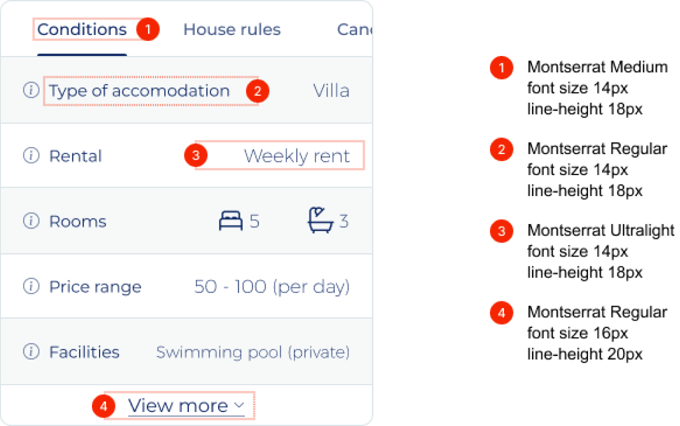
image: Shows the uses typography of different elements
Interaction design
This section will further explain the full functionality of the component and all actions the user can perform. To aid development the component has been fully prototyped in Figma to further explain the functionality of the component.
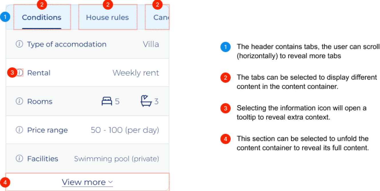
image: Annotations on the functionality of final concept design
When clicking the footer (4) the content sections will unfold, the copy will change from “view more” to “view less” and the chevron will change orientation to point upwards. By clicking the footer once more will reverse all the mentioned changes.
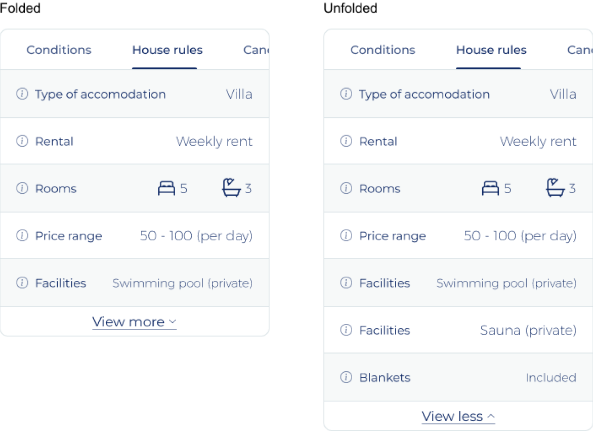
image: Example of folded and unfolded state of final concept design
Evaluation
It is important to monitor the effectiveness of the elements after it is implemented, especially as the component will not be AB-tested beforehand. There are a few things we can monitor to get a basic understanding on the usage of the feature, and potentially to further improve the component:
- How often is the footer (view more) clicked. Excessive use of this feature can indicate their is a need from the user to get more information than initially displayed or that the component is not functioning as expecting requiring more effort for the user.
- Clicks on the tabs. Over time this will provide us with an insights in what tabs are most popular helping us in determining what the best order for the tabs is. The order in which the tabs are selected is also important for these considerations.
- Does the number of information requests changes after implementation. Ideally there should be less information requests but adding an interactive, and potentially hard to use component can also have an opposite effect.
It is hard to set clear goals beforehand as the above-mentioned metrics will likely show some change, but will not explain why we see this change. Therefore the advise is to monitor these metrics, and if there are changes that raise concerns invest time in researching why using qualitative research methods.
Conclusion
The outset goals and requirement for the component have all been met, therefore the designed changes are success in the short-term. The delivered design is functional, meets it purpose and is visually in-line with the platform it will be implemented on. However, the mid-term and long-term success of the component cannot be determined yet even though there are no signs it will not be successful.