Auction Homepage Section
Auctions - vidaXL

image: Final solution design
UX/UI Designer & Researcher
1 Week - Early 2022
Resaerch, Design & Development hand-off
vidaXL is an e-commerce platform in over 35 countries across the world, with a focus on the European market. As reflected in their slogan, “live it up for less”, one of the key selling points of vidaXL is offering product for competitive prices. One of the way vidaXL delivers on this promise is by offering auctions in which the user can win new products at an even more affordable price.
Even though the auctions are functional and actively being user some customers, the full potential of the auctions feature is not being met. This is something we know for an earlier version of the auctions that was discarded of because of switching to Salesforce. With this in mind vidaXL tasked me with improving the homepage section of the auctions.
Problem / Opportunity
The current homepage section for the auctions does not do a sufficient job of getting customers interested, redirected to and participating in the auctions. As this is the only way for the user to get redirected to the auctions (without accessing an account), I suspect this is significantly affecting the performance of the auctions.
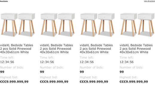
image: Example of the current homepage auctions section on bigger breakpoints
Methodology
For this project, I chose the four-step double diamond design process by Béla H. Bánáthy [1]. Reason for this is the chronological structure that ensures that every bit of research is in service of the next step. This perfectly aligns with the expectations of vidaXL and the agreed deliverable.
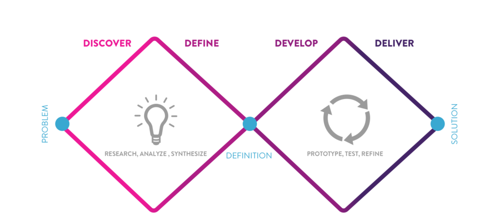
image: Visualisation of the Double Diamond Design Process
The scope for the solution is an design for an AB-test, of which the results will be used to evaluate the performance of the proposed solution in a fifth step of the project. As a goal to work towards, the hypothesis has been defined as;
Changing the design of the homepage section of the auctions will result in an increase in the Click Through Rate to the underlaying auction pages.
Workshop
For this project there is only a short timeframe and the available data on the current performance of the homepage section is limited to the number of click on CTA, therefore I chose to utilise the expertise of my colleagues for the discover, define and develop phases of the project. Using their view and expertise, I can come to a more substantiated design within the extremely short timeframe.
Because of the international nature of our team, the workshop was hosted in a hybrid way. A few colleagues were present on location, while the rest was able to join online. In preparation of the workshop the online participants were asked to have some materials at hand to be able to follow along, offline all the needed materials were provided.
Discover
Using the Rose, Thorn, Bud method we were able to identify the key problems with the homepage section of the auctions. By writing down pain points, opportunities and strong points, and grouping them as following:
Rose (strong points)
- Allows users to get great deals
- A feature competitors are not offering
- Great competitiveness once joining
Thorn (pain points)
- Unclear what value it brings
- Not clear how it works
- Feels untrustworthy
- No excitement or urgency on homepage
Bud (Opportunities)
- Not enough naviagtion options to auctions
- Not using Unique value proposition
- Failing to create enough excitement
- Not enough urgency to participate
As we are all familiar with the product already, we were able to use the rose, thorn, bud method right away and did not need any other research methods for the phase of the project.
Define
The next step of the workshop was defining further opportunities based on the findings from the Discover step of the workshop. This we did through How Might We (HMW) Questions, an excellent way to formulate opportunities. After writing down as many as we could find within 8 minutes we selected the most important ones:
How Might We Make it more clear to the customer that the auctions are a unique feature we offer in the market?
How Might We Draw more attention to auctions on the homepage?
How Might We Create more excitement among visitors for the auctions?
How Might We Communicate the value proposition for the user better to the visitors of our websites?
Since the workshop is held with creative people, I did not want to limit them to only one How Might We question in the next phase of the project. Therefore only the 4 most significant HMW questions were selected through dot voting.
Develop
The following step in the workshop was a method called crazy-8s. Through sketching eight different solutions within 8 minutes, while using at least one of the HMW questions, every participants came up with 8 ideas for a solution. After making the sketches we voted for the best, and I further developed this into solutions designs after the workshop.
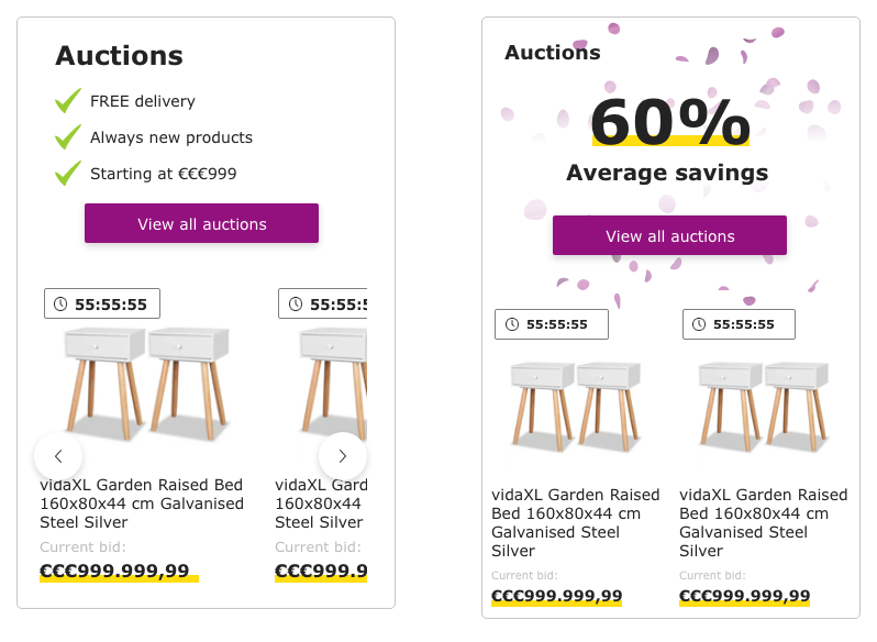
image: Solution sketches based on workshop output
image: Solution sketches based on workshop output
Because of the well-established component based design systems that is being used within vidaXL I was able to go directly to a high-fidelity design in these solution sketches.
Deliver
Based on the dot voting on the solutions sketches that were the result of the workshop with the UX/UI Design Team I developed a final design to be tested. This design takes into account the following opportunities that were defined in the How Might We questions:
- How Might We draw more attention to the auctions on the homepage?
- How Might We communicate the value proposition for the user better?
This by having an illustration that catches the eye of the user, making use of confetti according to the brand guidelines and by highlighting and explaining the value proposition for the auctions, in this case the average savings per item.
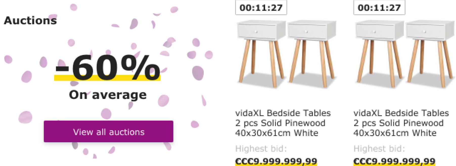
image: Example of the improved homepage auctions section on bigger breakpoints
This element consists of two components, the value proposition on the righthand side, which will be on the top for smaller breakpoints:
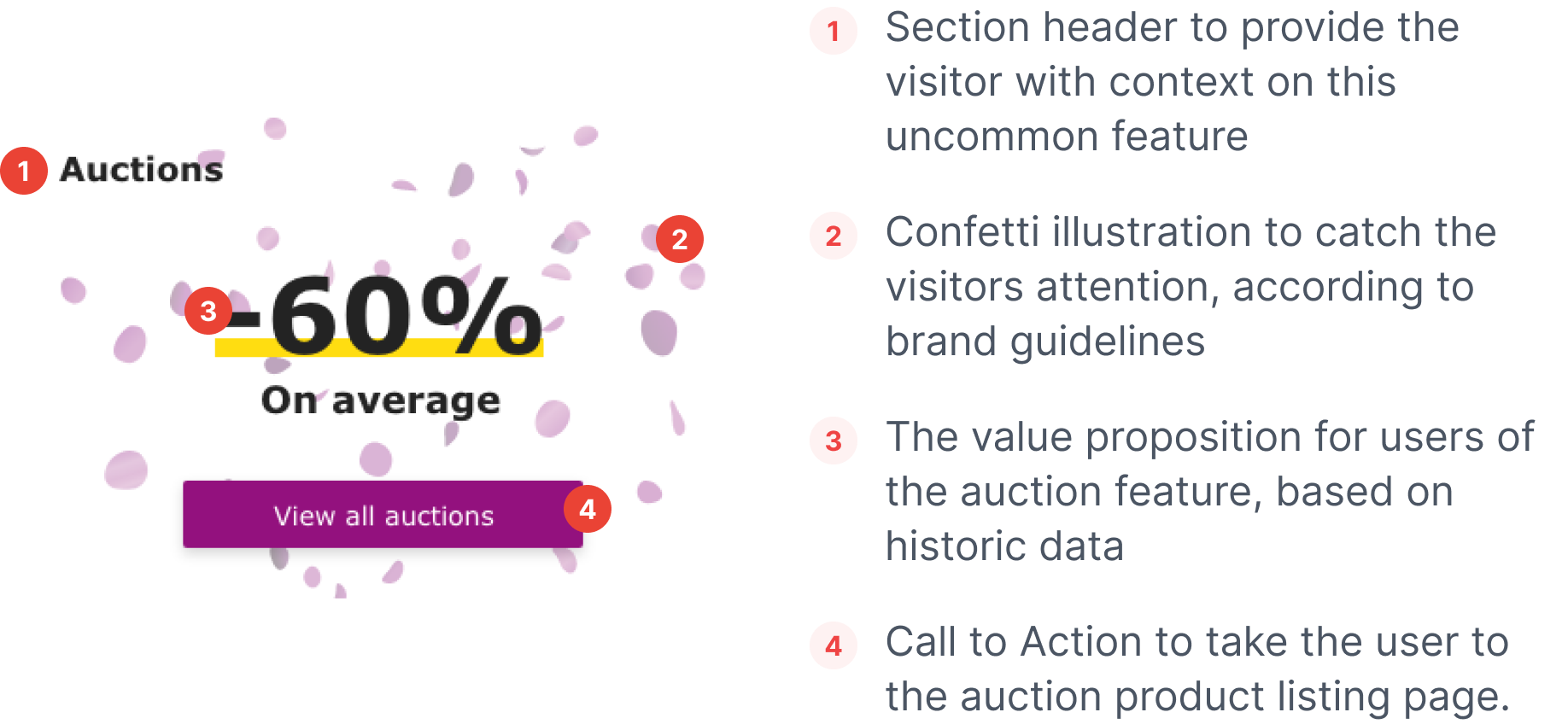
image: Explanation of the anatomy of the element
And secondly the auction product cards that will display the products up for auction. These are places in a carousel, the number of product cards that are visible to the user depends on the breakpoint but using arrows or by scrolling the user can always navigate between all ten product cards.
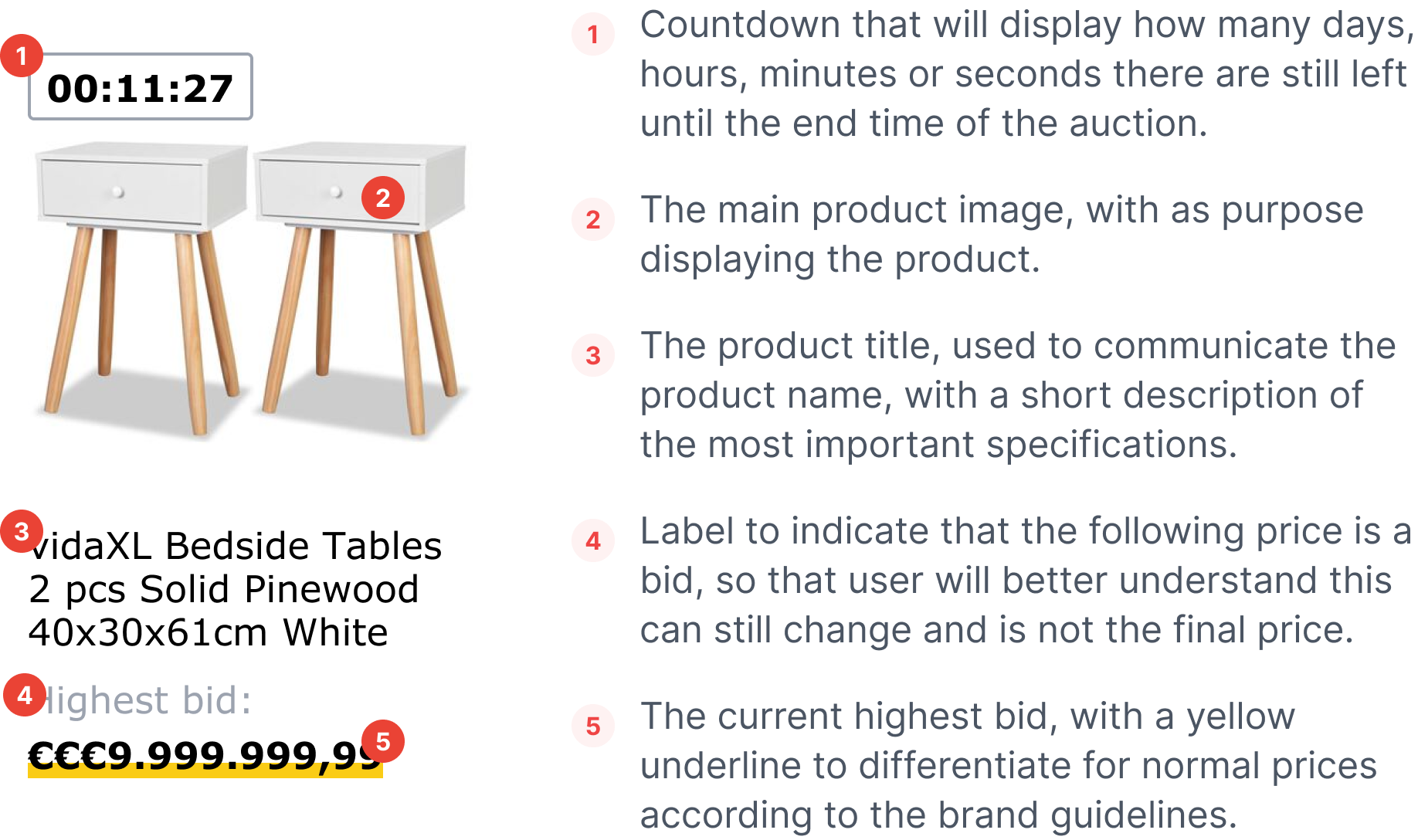
image: Anatomy of the auction product cards
The size of the auction product cards is dictated by the size of the image within the card. The image will always be square, and the width is is based on the different breakpoint in an responsive way.
Part of the deliver phase is handing the design over to the Ab-test developer, to ensure that the design is developed correctly to every last detail I like to provide as much detail as needed. Providing sufficient details is easy with a good design system and toolkit in place and will eliminate (part of) the back and forth between designer and developer.
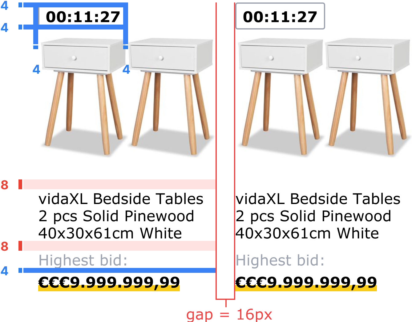
image: Example of detailed spacing hand-over
Besides a detailed description about the goal of the test, the functionality and Key Performance Indicators, I will always handover a full mockup, anatomy and details on the design like the spacing (see above).
Furthermore, I provide the development team with an detailed hand-off of the used typography, when possible referring to tokens.
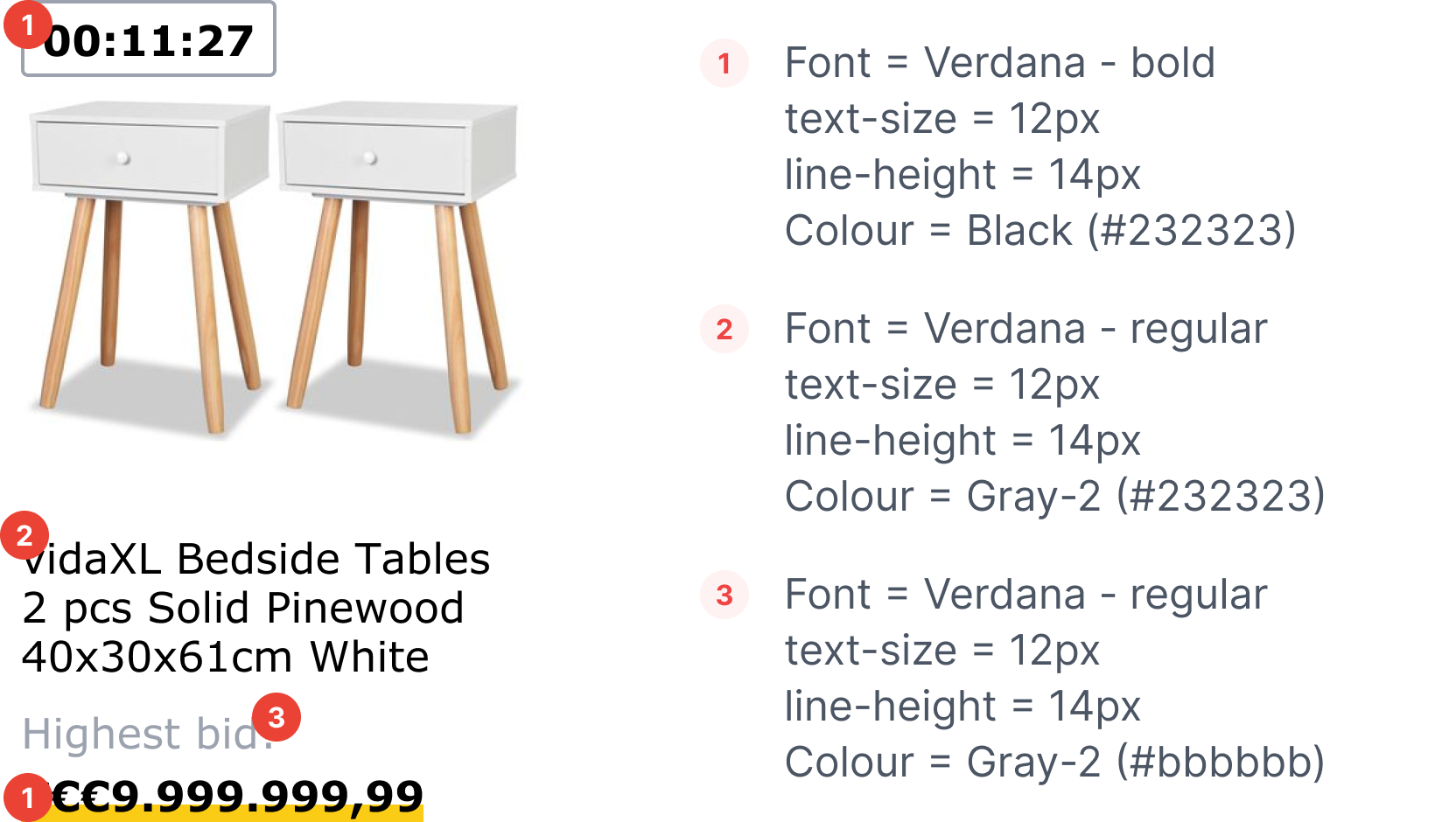
image: Example of detailed typography hand-off
Evaluate
As the fifth phase of the project the performance of the proposed change will be evaluated. This is done by directly comparing the design against the current design that will act as the benchmark. By directing 50% of the traffic to the current design and 50% to the improved design we get the fairest comparison possible.
As the test will be on a high traffic page, the test will run for two weeks in which we will reach the minimum amount of visitors and have a good chance at reaching the needed significance in the results. The hypothesis will remain: Changing the design of the homepage section of the auctions will result in an increase in the Click Through Rate to the underlaying auction pages.
| Original | Variant | Change | |
|---|---|---|---|
| Product Cards | 1% | 0.94% | -5,6% |
| Call to Action | 2,02% | 2,60% | +28,7% |
| Overall | 1,51% | 1,78% | +17,9% |
The results of the test are based on 170.000 visitors across 30 different countries and show us a significant change in the Click Through Rate. We do see a slight decrease in the number of click in on the product cards, but a great increase in the click on the CTA and in total. This is expected behaviour and therefore the test is successful.
Conclusion
As the results show a great increase in the main KPI, this design will be rolled-out to all websites. The created design will be evaluated once more before handing of the development for making this permanent change, to ensure quality. Due to the nature of the auctions, we were not able to predict a revenue increase based on this test, therefore the implementation will not be prioritised against other tests but pickup in a portfolio project.